Part of the module briefing required that I provide plans and written intentions for a selection of my final ten images which I’d chosen for Quay News, these were also to be included as part of a wider exhibition at The Salford Museum and Art Gallery (http://www.salfordcommunityleisure.co.uk/culture/salford-museum-and-art-gallery) – the final clients for this brief. The exhibition would feature work from each of my peers taking this module and would reflect on the various approaches each of us had taken in response to this brief, whilst also featuring some ‘hidden’ stories and images of interest relevant to Salford and it’s environs. The proposition being, that although this was a photojournalism brief, the images we had taken also had relevance in an art space, where people can take more time considering the images, their placement and meaning. Unlike a website where the original images would be seen in lower resolution and smaller in scale, here was an opportunity to have the images presented in larger format, higher resolution and in a context that isn’t just about telling a story for a news website.
To prepare for the gallery edit there was a seminar given by the curator of Salford Museum and Art gallery – Amy Goodwin, who suggested that before we looked at selecting images for the exhibition that we consider a few things…
Firstly, who were the audience for this exhibition? The museum and gallery is situated very close to the University of Salford so we were likely to see a lot of students and tutors but also school parties and children. As the museum is also a source of information and local history there would also be interested parties looking for similar with the work that went on display.
Secondly, we should consider the number of images that could be presented, ideally we were told 2 to 3 images and sizes A4 or larger was possible – framed or foam-board mounting.
Lastly, she suggested we consider the following things, but were not essential.
- Consider having a lead shot.
- Consider a variety of angles to add tension and interest.
- Choose images that people will care about.
- Galleries try to ‘add value’ for example a task for children, could you do something like this with your images?
Although the exhibition will not take place until May of 2014 – this preparation will lay the groundwork for the final exhibition and my part within that. I had a few things to consider…
The exhibit plan:
Having had ten images to play with for the Quay news clients, a suggested allotment of 2 to 3 images seemed meagre to say the least. Not least because it was difficult enough to portray the re-purposing of a building into a creative arts space and environment for artists and creatives, in 10 captioned images let alone 2 or 3.
Whilst pondering my dilemma, I kept thinking about context and how this was something I really needed for my audience – to have a point of reference so they could understand what the images were for and represented. The images could then be viewed and considered in isolation but ultimately in the wider context of my series.
I remember reading something that backed this idea up. It was an interview in Image makers, image takers with Camilla Brown,Senior Curator of the Photographer’s Gallery, London. Where she muses upon the issue of how people look at photography…
“…So the challenge with photography when you put it on a gallery wall is to get people to spend more time looking at the images. to consider why images are placed next to each other -why are they part of a series -and think about what the photographer might be trying to say. Context and captions can also totally change the way an image is interpreted, and become an integral part of the work in an exhibition.” ( Jaeger – Image Makers, Image Takers. 2007)
As this has huge relevance for photo-journalists who increasingly find their work at home in the gallery space as much as the news or media spaces. It was definitely something I needed to pay attention to, and although my work wasn’t war photography or some other profoundly relevant document of human sufferance, I still needed to make sure my audience understood my images as part of the original intent.
I decided that a more holistic approach was required. I would have three larger prints – the focus and bones of my set, but I would also include (if possible) several other elements that would give context and a depth to my series. These other elements would include…
- The full ten shots I submitted to Quay News as a set of polaroid-style prints that could accompany the three larger images. These could be mounted or more preferably, available as a tactile element – I like the idea of interaction and connection whereby a viewer can shuffle through the smaller set and then look up and regard the mounted images.
- Where possible I would like to include some of the images that were culled from the original short-list, these could be made available by printed contact sheets with notes on why they were culled or others included. These would give the audience an insight to the process involved in editing images for documenting purposes and maybe open some debate on whether they agreed with my choices – These contact sheets should be laminated and made available for the audience to hold and consider closely. Note cards could also be left for feedback and opinion to add a an interactive element.
- If possible a selection of items from the building or artworks featured in the images could accompany the set as a means to reinforce the images and their purpose. Permission for this element would need to be garnered but where possible. It would also mean that my images would need to be in an area where there were secure display cabinets.
If any or all of the above can be included then this will help reduce the need for explanatory captioning to my three images.

Exhibit Concept – Illustration by Hector Barros (2014)
(http://www.flickr.com/photos/snibbits/)Illustration undertaken as a commision for the purpose of illustrating my proposed exhibition space. Although the specifics of which items I can loan from Artworks as a complimentary display are unknown, his illustration grasps the intention well.
The Gallery Edit:
With only three large images to make an impact with, I felt I should include my three strongest images and let the smaller elements I have outlined above fill in the blanks. The idea being, draw them in with my main images, then let them explore and consider the other elements getting involved in the process and finally walking away informed and maybe even interested enough to visit Artworks on one of the weekly open days, perhaps even interested enough to perhaps get involved.
Upon trying to find three really strong images, I came across a couple of issues….
Firstly, three images really wasn’t enough to convey what the series was about. Secondly, the size and orientation of the three images was as important as the three images, in that, three different sizes made the set look haphazard whilst mixes of different orientations also had a similar effect. With this in mind, I decided to keep my selections to the same sizing and orientation.
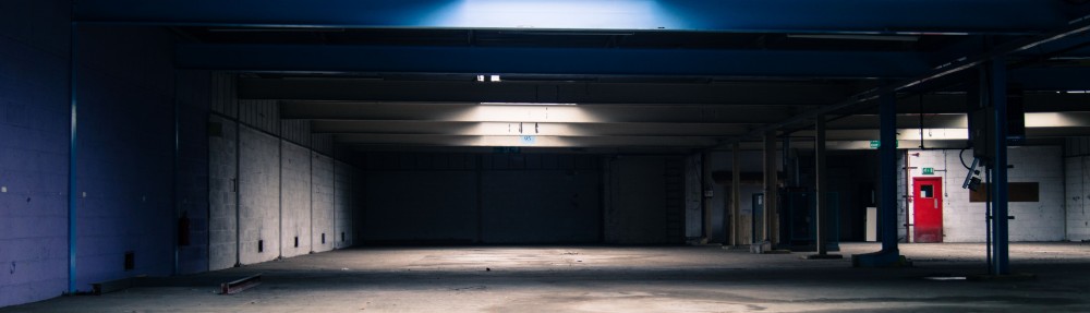
Here then is my selected three images…
I chose these three images, as I felt they were the strongest three visually and although they didn’t define the original series purpose they at least hinted at it. Hopefully with the inclusion of the other elements I have have suggested above, the images will gain greater meaning.
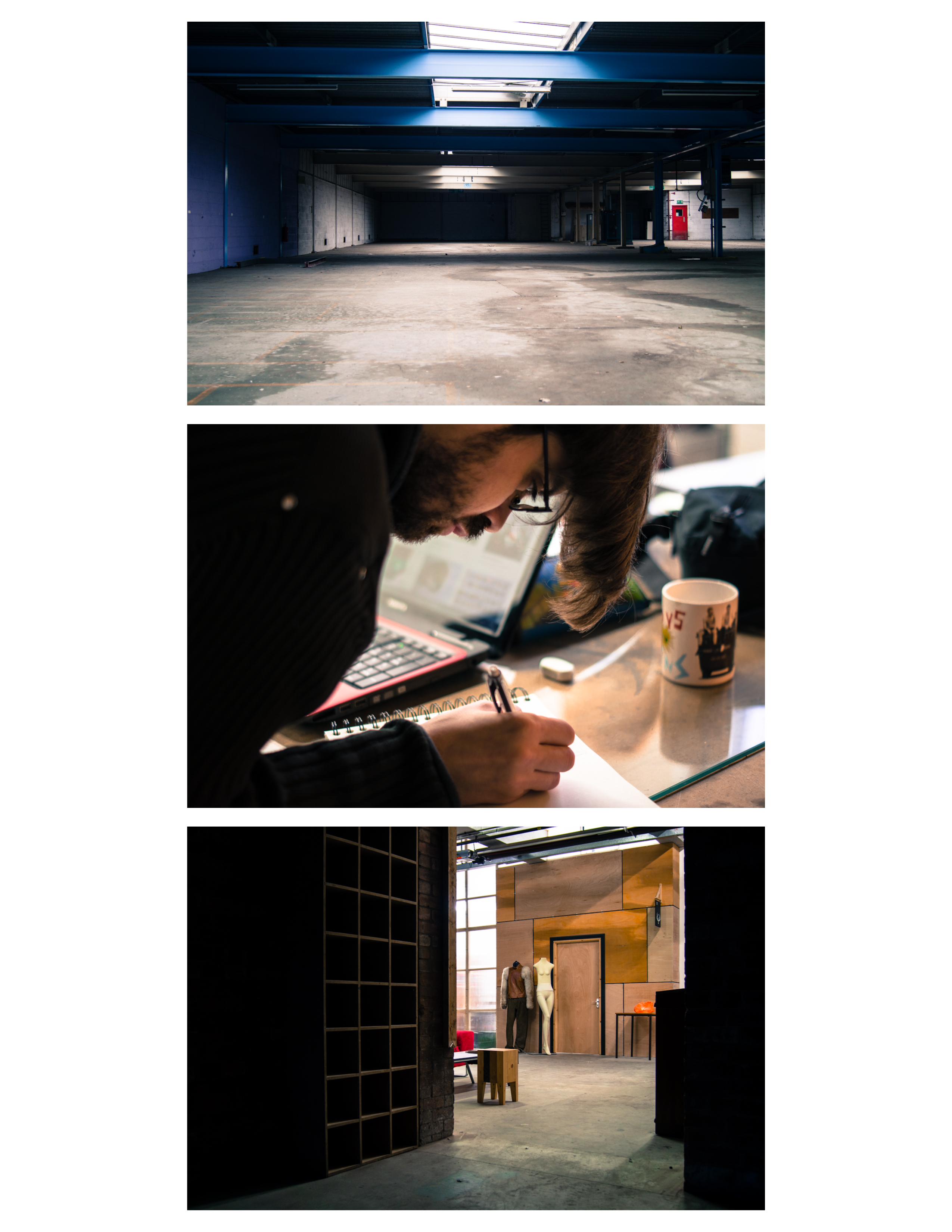
Finally, as I felt that three images really wasn’t enough to do the idea behind the Artworks set justice, I decided to do a four image edit – something that balanced people and place within the set. I’m already pushing my exhibition plan to the limit of what’s allowed with the extras I’m proposing, but if I can get away with four images I’d be much happier. Here then is the four image edit….
 The addition of a fourth image – in this case artist Jai Redman (top right), balance the image and gives an equal tension to person vs place. It also shows two differing spaces within the same building but at different stages of development, while the two artists are seen working on their own projects within the suggetsed context of those spaces.There is also like the three image set a small but very strong red element running through the series. In the absence of the Artworks sign and logo this is a small visual cue that I hope my audience will pick up on when viewing the smaller elements.
See future posts to see how the concept for my exhibition develops. W
